It Was Cool Until It Was Everywhere: Redesigning Mybbor.com
By Robby McCullough · Published June 5, 2026
I only put up this site a few months ago, but the pace of change in our AI-accelerated tech landscape made it look dated and sloppy already. I built the first version of mybbor.com as a vibe-coded experiment, leaned all the way into a 90s-hacker-movie aesthetic, and then kept bolting things onto it: a ham radio frequency guide, a live dashboard, a few posts.
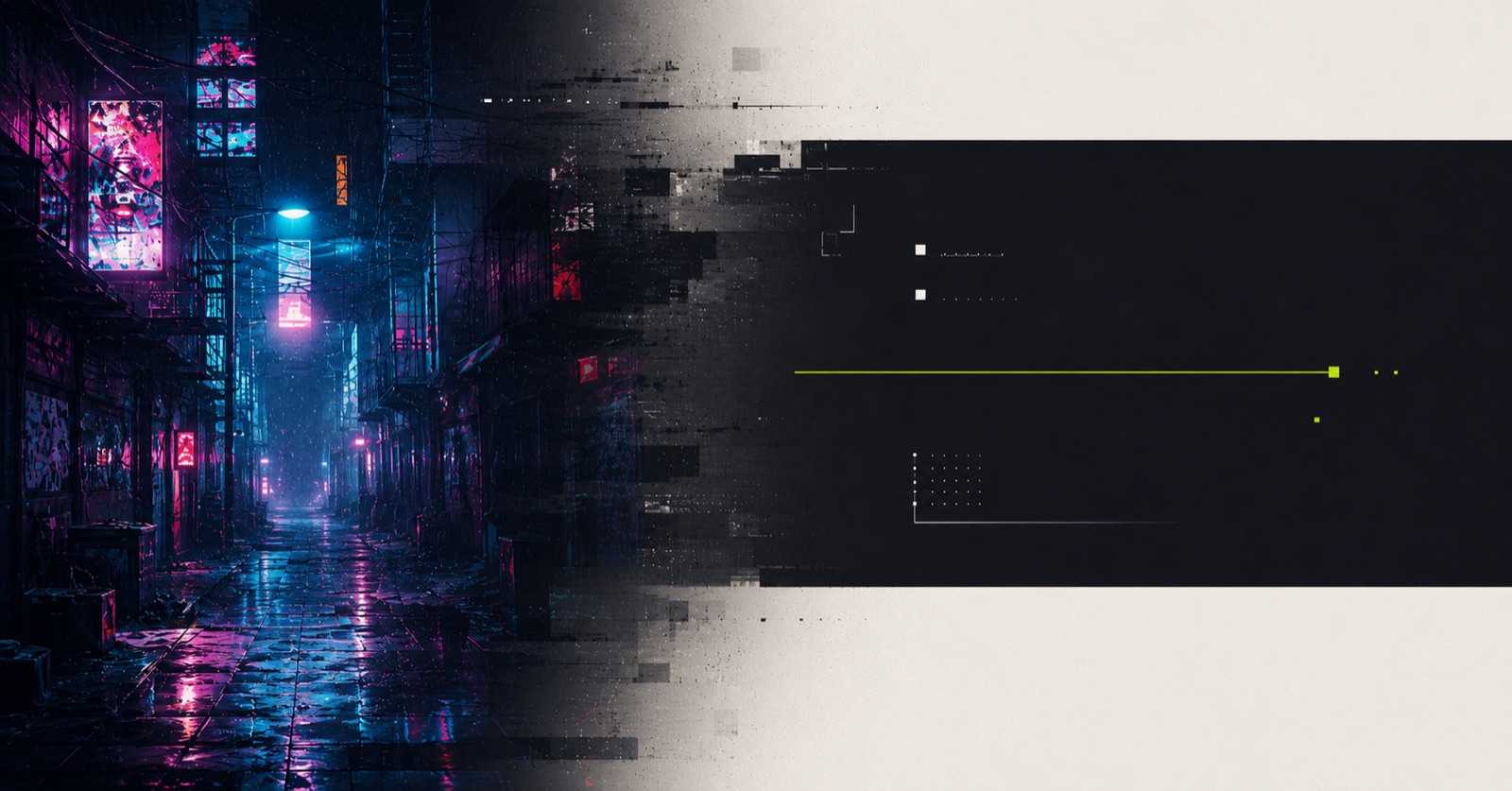
It was also, if I'm honest, full of AI slop. Glowing gradient headings, neon on everything, that particular over-produced sheen you start to recognize the second you land on a page. When I first vibe-coded it, that look felt novel. It doesn't anymore. As agentic web design gets more common, people have gotten a lot faster at spotting that sheen and a lot quicker to bounce off it. The glitchy neon hero was genuinely fun. The dozen glowing headings stacked underneath it were not.
So I spent an afternoon rebuilding the whole thing. Here's the before and after. Grab the handle and drag.
 Before
After
Before
After
The new direction came from a publication I'm working on called Art Direction Daily. Every day a unique issue is generated, surfacing the day's most important news and stories around AI design, and each day is reimagined in a new visual style.
One recent issue reimagined itself around a "product changelog" archetype: warm near-black backgrounds, paper-white text, one disciplined accent color, monospaced labels, a clean vertical timeline. To me, it feels like the calm, grown-up alternative to glowing-neon-everything, and I wanted to borrow that aesthetic for mybbor.com.
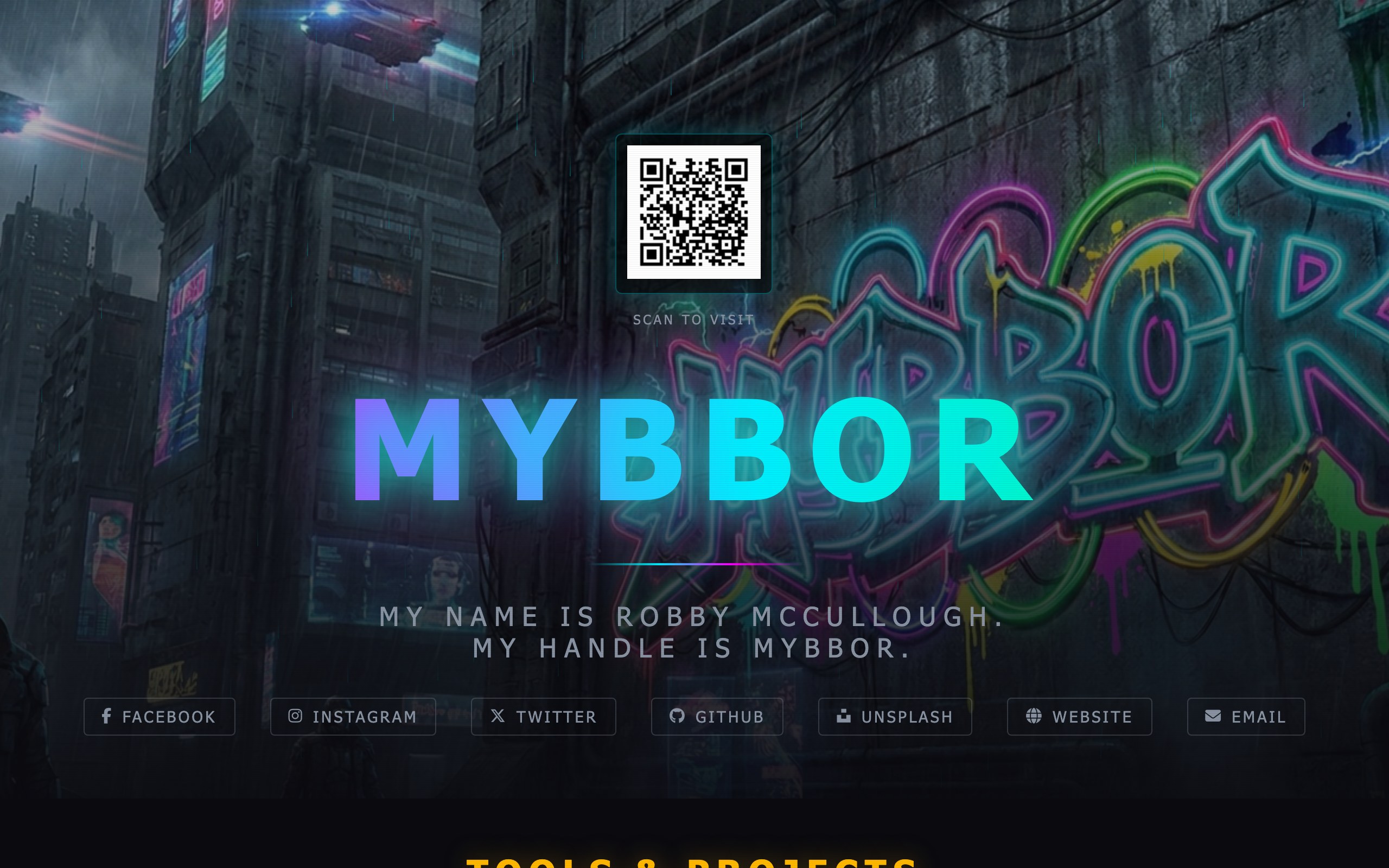
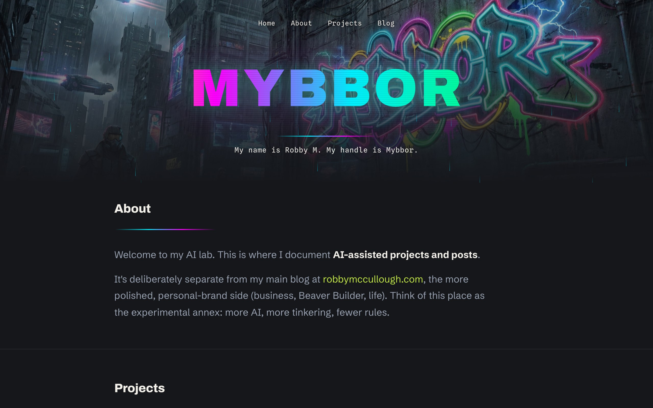
But I couldn't bring myself to kill the glitch logo. The MYBBOR-to-ROBBYM animation over the graffiti photo is the most "me" thing on here. So I kept it. The new site is a hybrid: a loud neon hero up top that fades down into a calm, readable, editorial body. Cyberpunk where it's fun, quiet where it needs to be legible. Neon as a deliberate choice, not as a default setting.
The bigger change is what the site is for. The business and personal-brand writing lives over at robbymccullough.com. Mybbor is now officially the experimental annex: AI-assisted projects and posts. An AI lab. Once I named it that, every other decision got easier.
One thing I held onto, just moved: the QR code. The old homepage had one front and center in the hero, and the idea behind it is genuinely useful. If I'm at a conference, or I just want to hand someone my contact info, I pull up the site on my phone, they point their camera at the screen, and it drops them straight onto a page with all my links. Gimmicky, sure, but it works, and it's a fun little party trick. It didn't belong in the hero anymore, so it lives down in the footer now, still one scan away. There's a dedicated connect page on my main site too.
The ham radio reference got the same treatment. I kept its radar command-center personality and calmed everything else down:
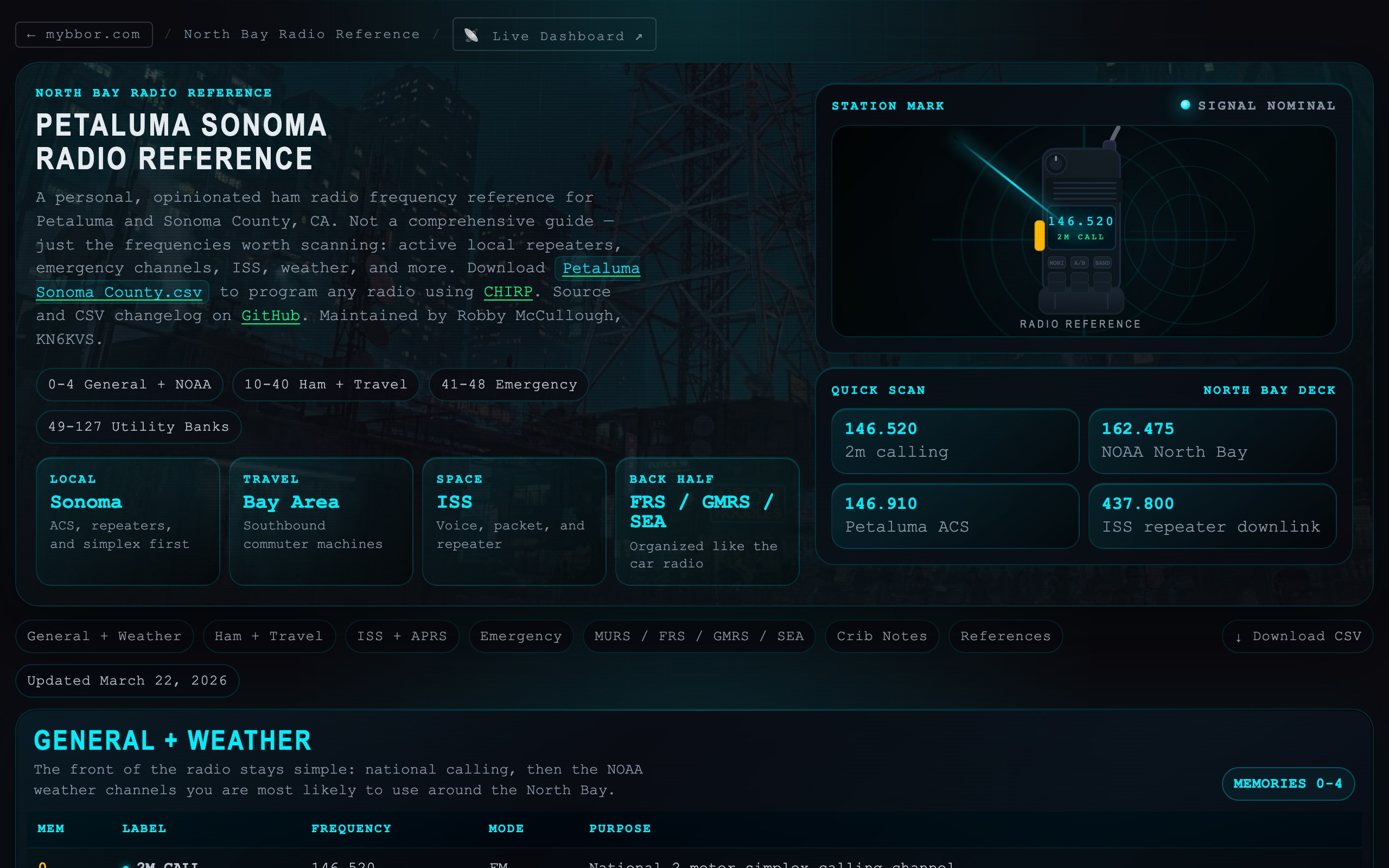
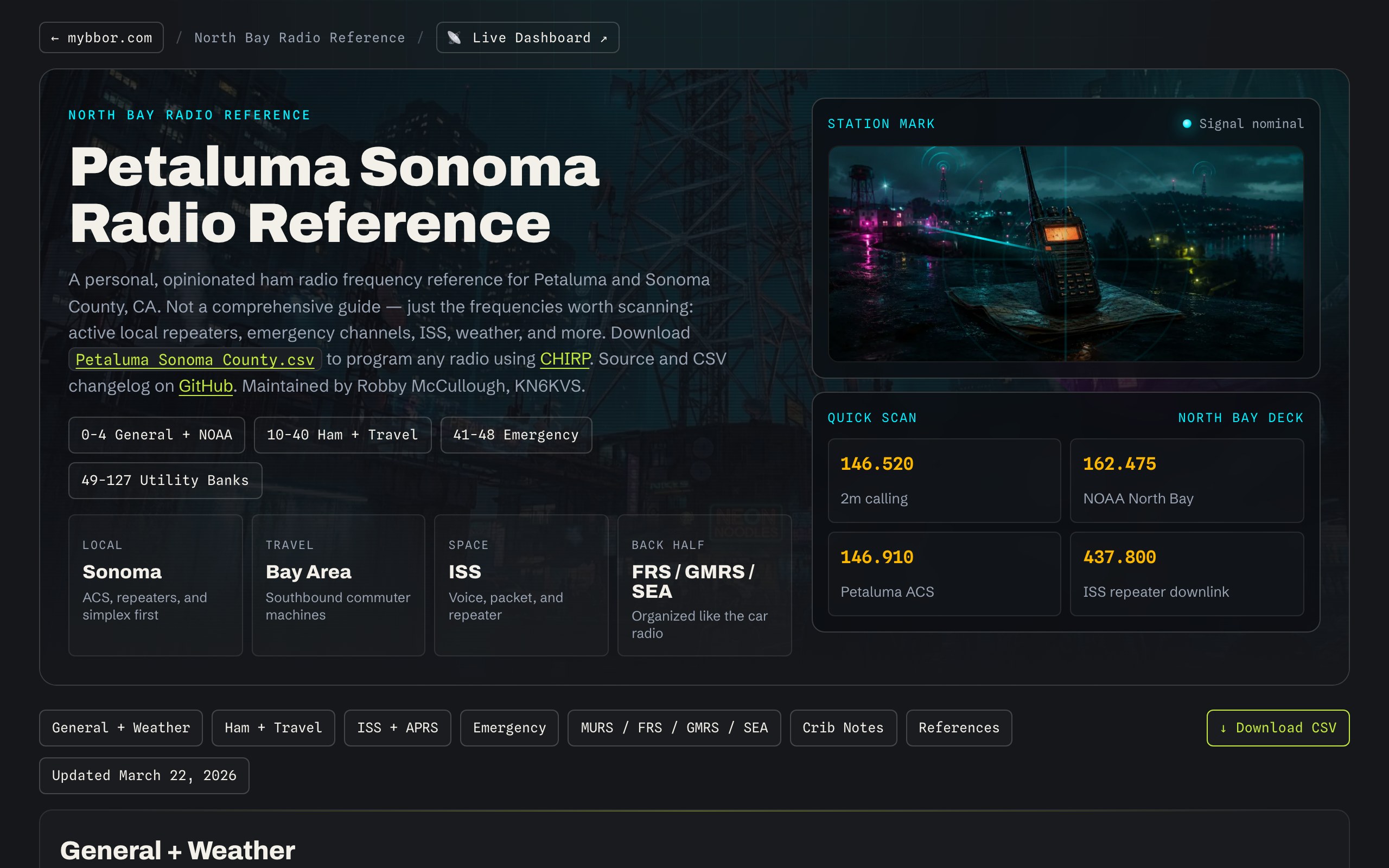 Before
After
Before
After
Steal the vocabulary
If I'd pass along one thing, it's that getting good design out of a model is mostly a vocabulary exercise. "Make it look cool" gets you slop. Naming what you actually want gets you something with a point of view. Here's the shape of the brief that produced this look:
Design with editorial restraint. A warm near-black ground, paper-white text, and a single disciplined accent color used only for links and labels. Monospaced metadata, generous negative space, a steady vertical rhythm. No glowing gradients, no neon on everything, no decoration that isn't doing a job. Distinctive, but quiet. Confident enough to leave things out.
Swap in your own accent color and your own references, and you're most of the way there.
It isn't live yet as I write this. By the time you're reading it, it is. More to come from the lab.